The modern paper book represents a pinnacle in the evolution of a physical medium to store and communicate information. Through trial, error, iteration, and experiment the paper book arrived at some pretty great features. Then we invented an electronic version of the book. In many ways the ebooks we can buy today are a lot like the first films, simply copying the traditional form in a new technology. They copy some of the basics, like text, largely filling a page, and then they stop.
Current eBooks are an anemic version of paper books and a totally failed version of what they will become
We also left out lots of features that make physical books awesome, and we’re left with a really limited version of what a book should be. Early films essentially used a stationary video camera to record the production of a play. It took time before directors explored the real potential of cinema to change points of view and tell more complex stories with editing and camera tricks. Before proposing a rethinking of eBooks let’s take a look at what paper books got right. What is worth continuing or improving upon in this new medium? What should we try to bring over to a digital version? Our interest is in the user experience, and while there’s volumes you could capture on the aesthetics of the experience, let’s focus on the purely functional goodness.
Spine: Identifying the book
Physical books offer potential readers a progressive reveal of their contents. Start with the spine which offers an economical way to identify the book. Packed side-by-side on a shelf the spines of physical books provide a rich information tableau giving the reader a number of useful cues for scanning and identifying books.
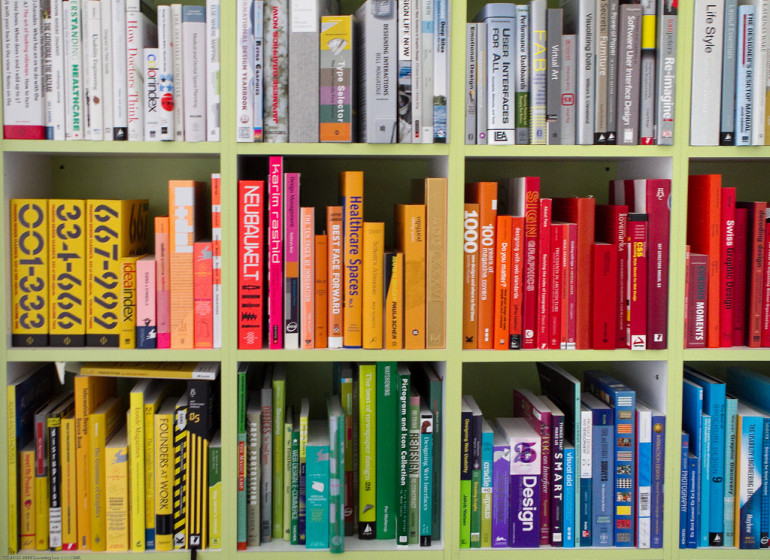
Obviously the title and author are useful, but size, color, typography, texture, layout and the publisher’s logo are often helpful in quickly scanning and recognizing a book. The relative location on the shelf and higher level organization such as subject, author or even color help readers quickly narrow in on the right shelf or bookcase (provided the schema is one they designed). The spine also gives a reader a sense for the volume of the book. A thick spine communicates a long winded work, while a thin one suggests a quick read.
Front cover: An invitation to pick the book up and open it
You pick a book out of a shelf or up off of a table.

The large cover surface provides a rich canvas for layout and design. It conveys shape, it carries typography in the form of title, author, and any other elements such as a subtitle, publisher, etc… The color, texture and design of the cover give the book a distinct identity (usually).
The design of the cover should be an art form.
When done well, the cover should capture a potential reader’s eye from afar, entice them to pick it up, open, and ideally buy it. The cover is informational, but ultimately the cover of a modern book is an advertisement for the contents. Even after you buy the book, you can enjoy the cover. Coffee table books which are intended for visual display, are especially intended to show off the beauty of the cover.
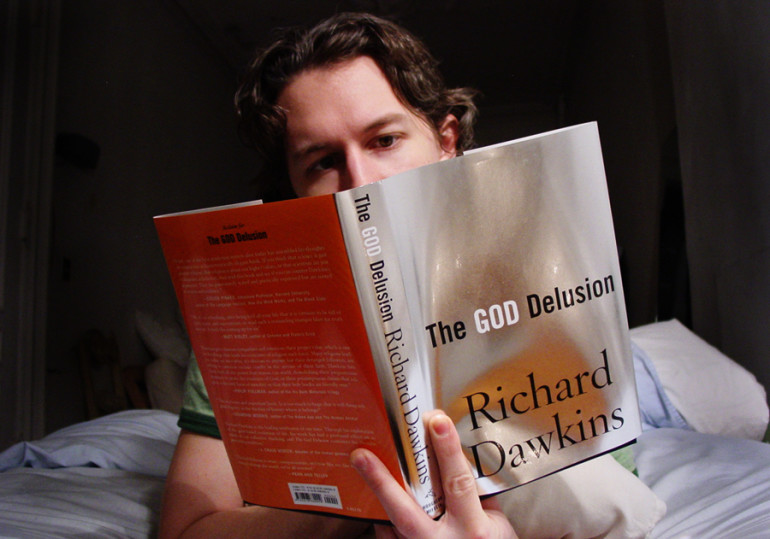
There’s an unsung social aspect of the cover; it advertises to others the book which you are reading. You might even purposely select a specific type of book to read for your commute based on what you want to communicate to those around you. You might conceal a book in the dust cover of another if you are somewhat embarrassed about the book you’re reading. Even if you don’t care what people think, the cover is there for them to see. Maybe they judge, but maybe, they are inspired. Your reading has turned into an advertisement for the book. They take note of the title, or even chat with you about it, to discover if it’s worth reading.
Back cover: Sealing the deal
If the front cover is an ad, then the back cover is the fine print. The back cover is where you turn to make a purchasing decision. Often it has a summary of the book, publishing information, and endorsements from other authors or celebrities. It’s also where the price and barcode are located.
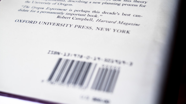
You might pick up a book for it’s gorgeous cover, you might even thumb through a few pages, but you’ll end by turning the book over for a final evaluation. The publisher works hard to sell you on the book. The summary is usually well written and presents a compelling case for the book. If you don’t believe the summary, the endorsements may nudge your decision. Once you purchase and read a book, the back cover ceases to provide any value beyond protecting the contents, or perhaps convincing a friend who’s examining the book to borrow it.
Table of contents: scanable summary and deep linking
A good table of contents gives you a great summary of the book. If chapters are well named you get high level foot view of the book, just scanning the contents.
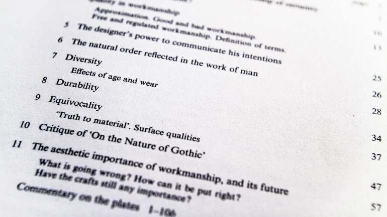
You are introduced to the topics/themes within the book. You can see the sequencing and even get a sense of proportions by glancing at the accompanying page numbers. The page numbers also allow you to manually “hyperlink” to particular section.
Pages: miniature context frames, content
Depending on what kind of book you’re reading pages might contain images, photos, foot notes, side bars, end notes, and many other types of formatting. We’re primarily interested in the generic book, so we’ll stick to the basics. Chapter/Section pages

Some books reserve a whole page to mark the beginning of a section or chapter. The page tends to be blank with the exception of the title for the upcoming section. This kind of break is useful for readers who want to skim, or are returning to a book to look something up. The blank pages act as breaks, so that when you thumb through the book the chapter breaks stand out and you can more easily locate the next big break. Content pages The pages of the book are where all the good stuff happens, content wise. The majority of the surface of the page is covered with content; type, words, illustrations or images.
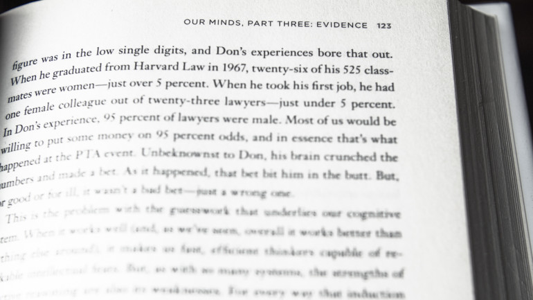
The margins of the page hold the page number, and in some books they display the title or chapter–sometimes both. The page number is useful because it gives the reader a sense of progress. It also makes it possible to jump around to specific pages as referenced in a table of contents or index. The name of the book seems odd as it’s unlikely that someone forgets the title. It does provide a kind of watermark, should the pages be scanned and reproduced, at least the title will accompany them. It also serves to help nosy fellow travellers discern the book being read over your shoulder, much the same as the cover does for those in front of you.
The best part about the margins of a book is that they are mostly empty
Empty margins invite either almost sacred reverence or volumes of user contributed marginalia. For some it is almost unthinkable to write in the margins, it somehow disrespects the original work. For others it is almost impossible not to, because their own ideas and insights are as important to their reading as those of the initial author.
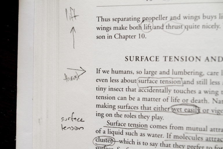
Marginalia thrives in large wide margins; it can take the form of words, diagrams, pictures, doodles, or coding. But it can also be squeezed in around the edges of a cheap book, or even between the lines of copy if need be. Text may serve as jumping off points for underling, highlighting or commentary, which are another form of reader interactions with the book.
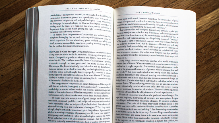
In most books pages are printed on both sides. This makes for a reading experience where one page is read, the reader then shifts their gaze and continues reading on the opposing page. It is not until they reach the end of the second page that they manually turn the page to begin anew. Content remains static for a relatively long period of time. The only movement required of the reader is the rapid saccade of their eyes across each line of text. It takes relatively little work to read a book this way. Your eyes do most of the work. It’s also fairly easy to keep your place. As you read you develop a temporary map of the page and your place on it. It’s easy to look away and quickly return to the same location on the page. This means distractions are not particularly catastrophic. Reading a paper book feels relaxed, you never feel pressure to remember your place, the static nature of the work creates a sense of calm reliability.
Reading a paper book feels calm and effortless
Many readers find they develop longer term location memory for printed text. They are able to recall what side of the book a favorite passage was on. They may also have a general sense of it being near the top, middle or bottom of the page. The very physicalness of the page allows it to become a kind of crude map of the content. Pages as physical artifacts necessarily produce bulk for the book. As a reader you have a crude but effective measure of progress, simply by feeling how far through the book you’ve read.

Page numbers are abstract and only convey how far you’ve come. The simple thickness before an after your reading place gives a crude, but effective sense of overall progress.
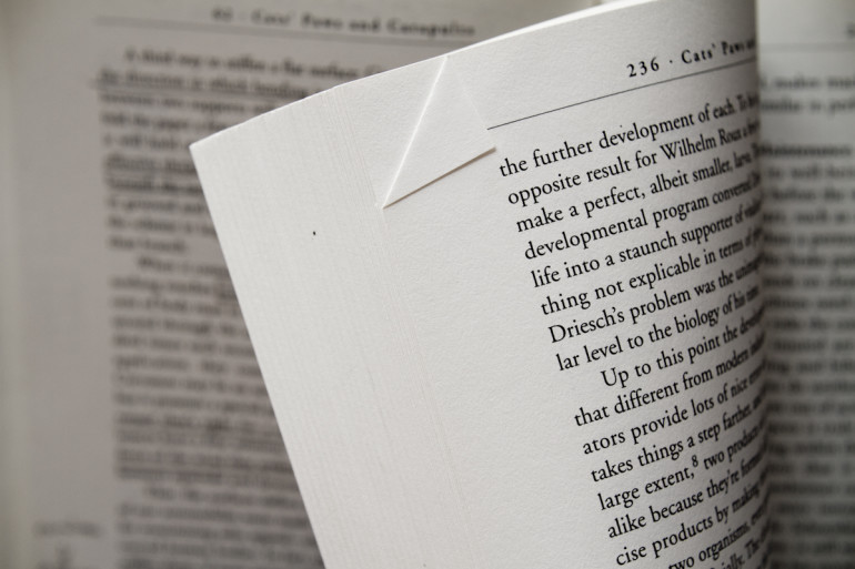
The thin uniform pages also allow for easy “bookmarking”, creating some reference which is easy to return to. Some books feature built-in ribbons to serve as an ever ready place keeper. After-market bookmarks, or even just scraps of paper allow you to save your place at a number of points in the text. For those that don’t mind mangling their books, simply bending the page corner to dog-ear your place is a fine, built in solution.
What to bring over from paper to digital
So there’s a lot of useful features built into paper books. Why not bring what we can over to the digital space?
The spine
A spine is an efficient way to identify a book in a collection. Shelves of books, stacked side by side make it simple to scan for a book, especially if the ordering of the shelf matches the readers mental model. The relative size or shape of one book to another is a useful distinguishing feature. Digital books are almost universally displayed with the front cover facing the user. It’s a nice aesthetic experience (if the cover is well designed) but it’s hardly efficient for finding your book.
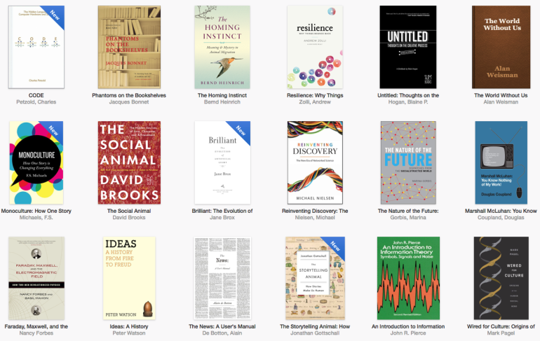
Readmill, the awesome and now shut down eBook platform had an approach that seemed like a nod toward the spine.
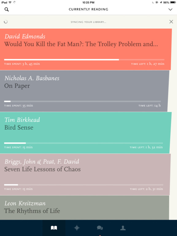
The colors were arbitrary. So were the shapes on the right, but this randomness was consistent and you could rely on your recall of a red spine, or an edge that stuck out more than those around it. It’s a far cry from the richness of a paper book spine, but after getting used to it, it felt like a solid way to scan through books. If you’re not going to turn digital books on their spine, at least present them in a non-uniform size and shape. The graphic consistency may make for a happy designer, but utterly frustrates developing a scanning sense for a book’s unique characteristics.
The external front cover
The cover of the paper book does a great job advertising the book to those around you. This may seem like a pointless feature, but good placement of advertising is worth a lot. Why not add a second screen to a tablet reader on the back-side. An e-ink screen would do a fine job displaying a static cover as a form of passive advertising to others.
Marginalia/highlights
Paper books are awesome for marginalia. No digital book even comes close. Yes you can add a note, and there’s a lot that could be improved about that process, but you need more.
Support for digital marginalia is a complete failure of imagination
Marginalia is more than than simply writing a note: It’s doodles, diagrams, it’s drawing relationships between words in the text. It’s highlighting and redacting. It’s fully owning and participating with the medium the words are printed on. We need a strong design leadership to produce a interactive form of digital marginalia worth adding to books.
Facing pages
Facing pages deliver a lot of reading goodness. The form factor of a digital device strongly inflects away from the dual page approach and makes it easy to go with a single page at-a-time. On an iPad you can turn to landscape mode and it will automatically display as two columns, effectively giving you the same experience as a paper book. This approach makes even more sense when considering aspect ratios like 16:9.
Conveying progress
Page numbers give an abstract sense of progress. Your location in the tome itself gives you a stronger sense of progress toward completion.

Digital books have adopted a progress bar to replace the sense of physical progress. Many also include page numbers which just seems silly when they change if you alter the font size. Some absolute reference like a page number is useful, but it seems like there’s work to create a way to express this that fluidly translates in a digital medium.
Pagination (turning pages)
Pages in a paper book must be turned; there’s just no way to move forward without it. With a digital book pages aren’t inherently the right choice. Because the virtual space is infinite, the more native solution seems like a book should be one long scrolling experience. There’s much debate over the “right” solution.
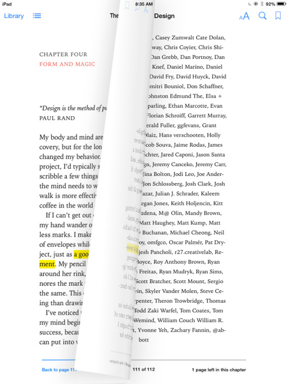
What seems clearer is that a totally skeuomorphic approach is silly. People have been navigating digital pages for decades without artificial paper animations to help them understand what’s going on. Reading a paper book (and turning the opposing pages) is easier and feels more stable. Try reading an ebook on a reader that scrolls the content and you find yourself struggling to figure out how far to scroll. You feel more tired from the constant tracking changes as you scroll. If scrolling, or something more appropriate to a digital medium is going to fly it’s going to require further design.
What should be left behind
The back cover
The back cover is useful for paper books because you’re likely handling them in person. The hard sell of the back cover just doesn’t have a place in a digital world, where the sale of the book will either be on a website or a media app. Everything a buyer might need to know and a much more (reader’s reviews, other books which are similar, etc..) is available without attaching it to the book itself.
Chapter/Section pages
While the section dividers are useful for a paper book, they are a waste of time in an electronic one. The strong break is useful as a communication device from the author to the reader, but the
Bookmarks
A physical book needs something to allow a reader to return to their last read place in a book. Digital books remember this for you. You don’t need bookmarks. Highlighting and notes are more effective bookmarks because both should deep link you into the book, and they allow for finer control. You aren’t marking the page, but the specific passage to return to.
What digital has over paper
Digital has a number of natural advantages over paper. Some things like a table of contents are an easy win. Not everything below exists, making it real would make for a better eBook experience.
A dynamic cover
If the cover is an advertisement, than digital covers have a clear advantage to paper. The cover of a digital book has no reason to remain static, it could dynamically adjust to the person viewing it, displaying the most compelling cover to them. It could also be animated of video. There’s a lot of room to make covers a truly digital experience.
Table of contents
A table of contents is a clear improvement in a digital book. The hyperlinking of a chapter title to the actual location in the book makes using the contents a pleasure. It is effortless to jump to any part of a book with a digital table of contents.
Non-destructive marginalia
Everyone should feel great about adding marginalia into a digital book because it’s non-destructive. Digital also allows you to share them, to export them and to use them like bookmarks to link back to a specific page or passage.
Future of the book – Part 2: What an awesome digital book should be
I’ll be writing a follow-up piece in the near future on what a digital book should be.
