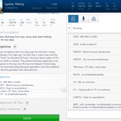
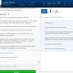
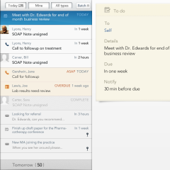
Practice Fusion is a free web-based electronic health record company founded in 2005. The SaaS startup provides physicians and medical professionals with free, advertising-supported EHR and medical practice management technology allows them to run their office and document encounters with patients.
In 2011 Practice Fusion hired Cooper to design and prototype how their web-based free EHR would work on an iPad. Practice Fusion’s free EHR is a disruptive force in the medical technology industry, and has given many doctors their first real exposure to an electronic method of charting and running their practice. The mandate from Practice Fusion’s CEO to the Cooper design team: Imagine the optimal touch-based, EMR app; setting a new standard for medical software. We were to conceive a fully featured product vision, while considering that functionality would be released in iterative, sequential cycles.
Team
- Two interaction designers, visual designer, prototype developer, engagement lead with minor participation.
- My role: Lead designer; client engagement, user research, wireframes, generative role in design, presentations
Duration
~13 weeks
Final deliverables
- Interaction design of three main functional areas of the interface (deep scenario and variations of reviewing patient history and documenting an encounter, shallow but wide scenario for using messages and tasks, demonstration of navigation through browsing history)
- ~100 pixel perfect rendered static screens
- PPT Deck scenario walktrough
- 100+ pages of documentation covering design principles and behavior
- Working code prototype
- Live on-stage introduction and demonstration of the prototype for Practice Fusion’s Connect user conference
- Documentary style trailer video of the project
Process
Research
We started with a couple of days of stakeholder research. We interviewed the CEO and all pertinent executives and engineers within Practice Fusion. We spent more time with the head of product to understand his goals and to boot up for a close collaboration over the next few months.
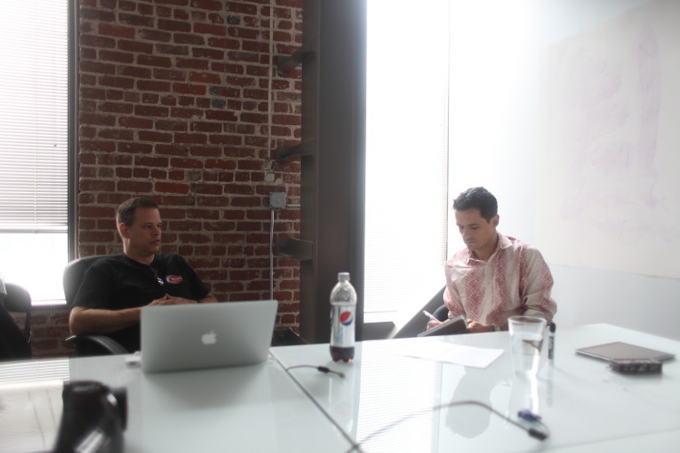
We followed up with a week of user research. The team visited many doctor’s offices for ethnographic research. We observed and interviewed doctors and nurses, looking for patterns and attitudes around documentation, technology and patient care.
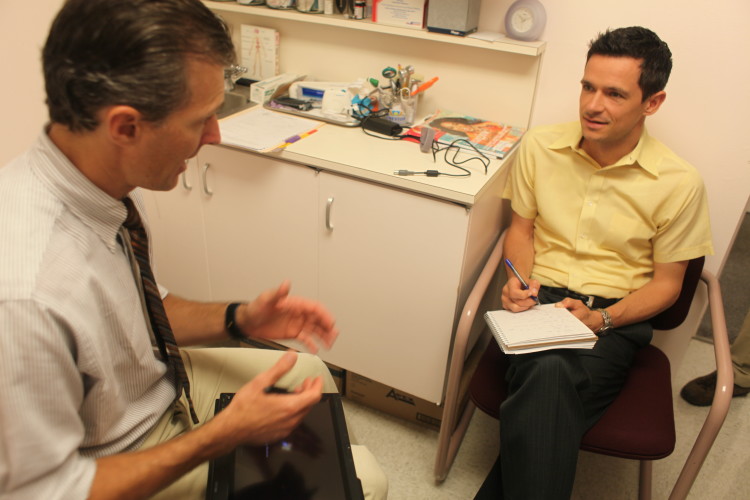
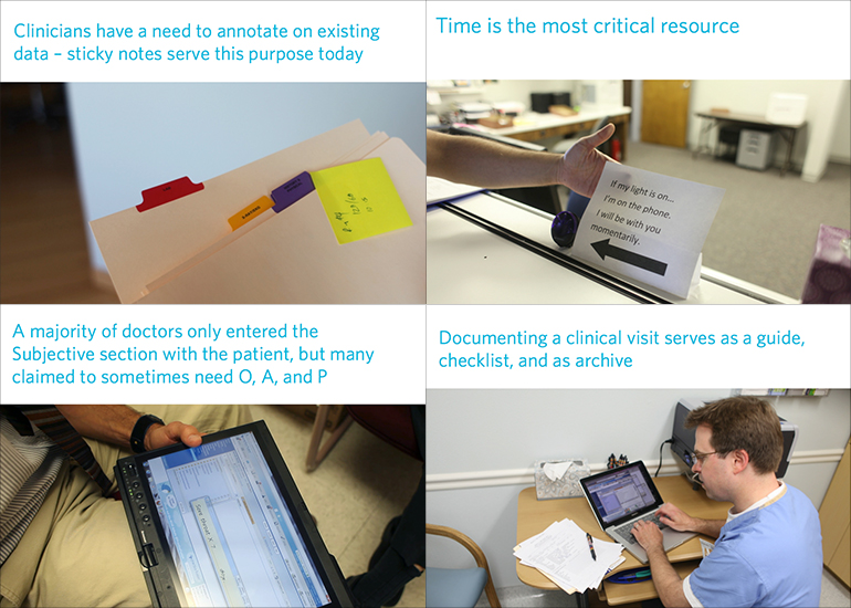
After our research we sifted through our notes and photographs to look for insights, disconnects, opportunities and material to inform our personas and scenarios. We presented our research findings to the Practice Fusion team to ensure that everyone was working from a similar understanding of their users.
Modeling
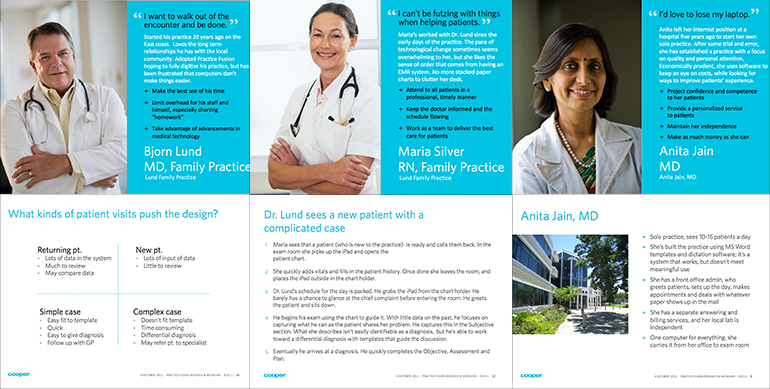
With strong agreement on our findings from Practice Fusion we developed a set of personas to guide our design. The Practice Fusion team was not familiar with user centered design methods, but was able to quickly adopt the personas we developed for the project.
Exploration
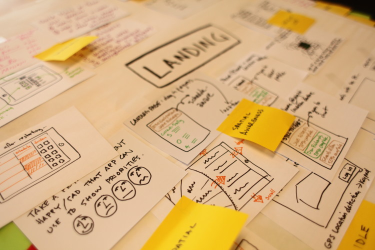
We conducted an exploration workshop that included both the Practice Fusion and Cooper teams. The goal of this collaborative workshop is to get everyone involved, to get pet ideas out into the open and to explore the edges of comfort in pushing the boundaries. The half-day workshop produced lots of wild ideas and helped us have valuable conversations around security, first experience, workflows and mental models.
Framework
At Cooper we refer to our initial set of design as a Framework. We give it a special name because it helps clients relate to it differently than wireframes. The goals of our first design pass are to express a full flow through the product. We keep it intentionally sketchy so that we don’t get bogged down in the details before getting agreement on the big picture.
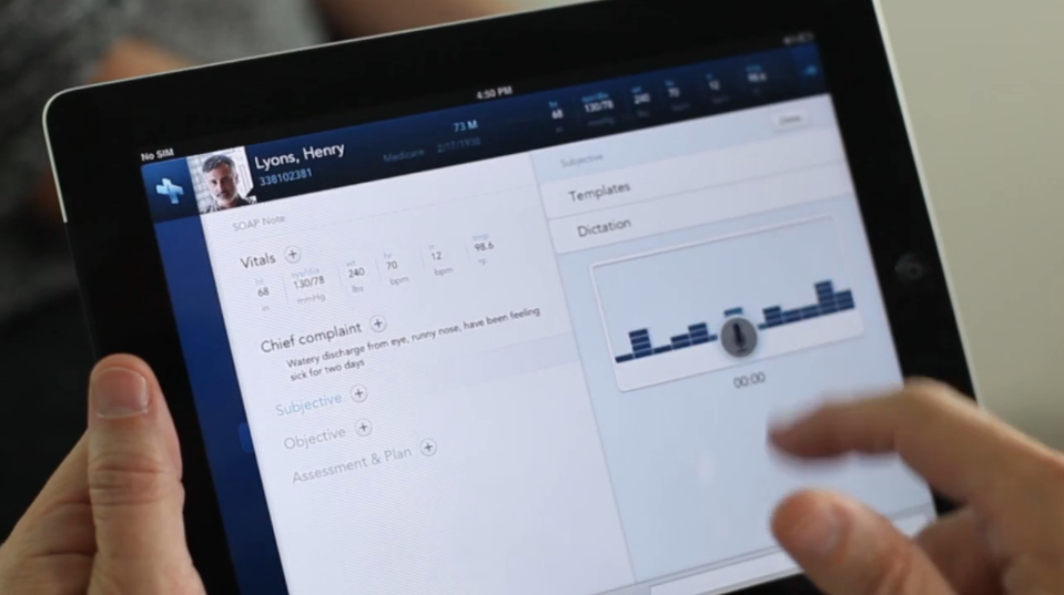
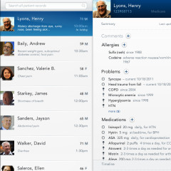
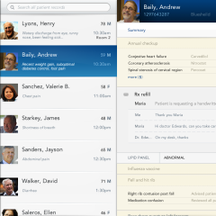
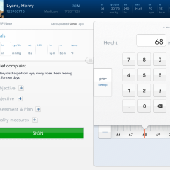
For this project our Framework focused designing how to best split up the small screen on an iPad and how to navigate in a way that was both simple and powerful. We also confronted the fact that typing on an iPad is a frustrating experience and a task that wouldn’t contribute to a safer patient record. We designed a number of novel approaches to avoid pulling up the virtual keyboard which included; reuse of prior data, custom number input, voice (this was before Siri was announced), and templates. My role for this was to generatively drive the design. The other interaction designer on the team acted as my thought partner throughout the process. Testing the design with questions and insights as I drew and shared my ideas. (This is a formalized structure at Cooper and all design teams operate this way. If you’re reading more about it, I was the Generator for this project).
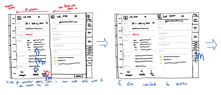
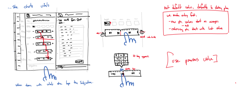
After a week of design we presented our Framework to Practice Fusion’s team. They had great questions and thoughts but nothing came up that caused us to rethink our framework.
Detail design
We quickly moved into a more detailed version of the sketches because hand sketches don’t answer questions about screen real estate well. This next iteration was in Adobe Fireworks. Drawing at a 1:1 pixel ratio allowed us to get a better sense for size and helped us make better decisions on how to divide up the screen.
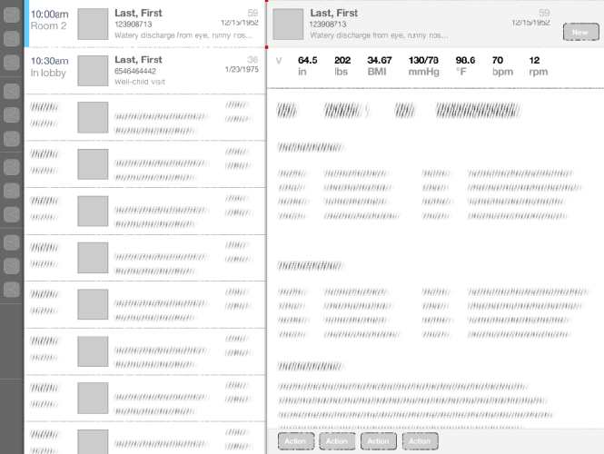
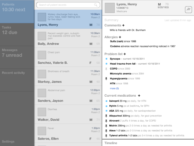
Prototyping
As we explored additional scenarios and generated lots of refined static screens we also worked with our in-house developer over a week to prototype a small set of functionality. We worked hard to make the deadline but managed to create a really nice demonstration of how the app should behave and which also demonstrated features that showed we understood the needs of our users.
Practice Fusion iPad Prototype DemonstrationDemoing the prototype
I was asked to introduce and demo the prototype to Practice Fusion’s user conference. I gave a short demo to of Practice Fusion’s most invested users. The applause showed we delivered on the promise and had designed something doctors were eager to start using.
