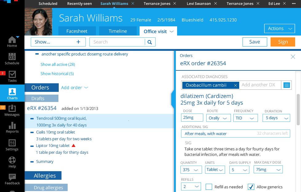
Hiding elements
Elements of the screen which provide good initial context scroll off the screen as the user indicates their intention to drill into the content on the screen. They reappear when the user scrolls up.
Pinned interface elements
Pin to the top of the interface when scrolled as they help provide context for the still-scrolling elements below.
Problem these address
Doctors need local navigation while getting around the system, but once they open a patient chart they need lots of screen real estate. The local navigation just takes up precious screen space. Doctors in particular complained about not having enough screen space dedicated to charts.
Why this approach solves the problem
By making the interface more dynamic and hiding elements we could increase the usable space for the chart. While a doctor is navigating to a chart the local navigation persists. As soon as the doctor scrolls down, indicating an interest in the chart, the local navigation hides away, giving the chart more room. The sticky headers help anchor the information on the screen so that long lists or inattentive users can always quickly regain context for the information on the screen.
